Why Mobile Optimization Matters for Your Sales Emails
One thing you're probably not thinking about when writing your cold emails? How it looks on your reader's phone. Here's why mobile is everything.

I'm going to go out on a limb here: you're reading this on your phone.
Data shows it's where you're 8x more likely to first open an email. Even when you're on your computer, your phone sits right next to your laptop.
It's basically a notification tab for your laptop.
Don't believe me? A story...
This week, I had a kickoff call with a new client. The icebreaker? What's your phone background? Everyone had their phone ready.
Why am I harping on this?
There's a massive disconnect in how we send and receive email.
We're 3x more likely to hit send from a computer. That 3x is just general email. I'd argue for sellers (especially cold email) that likelihood is probability +10x that.
That disconnect is why we (Lavender) built a mobile editor in the inbox.
We saw the best reps were writing emails and sending them to themselves first as a gut check.
Sometimes, we think things will translate well, and they don't. Check out this email:

It looks okay... right?
I pulled out key points, so they're easier to read. It's a little long, but overall the message is at a 5th-grade reading level (good).
It should be easy to read... but what's your reader's first impression? Here's that email on my phone:
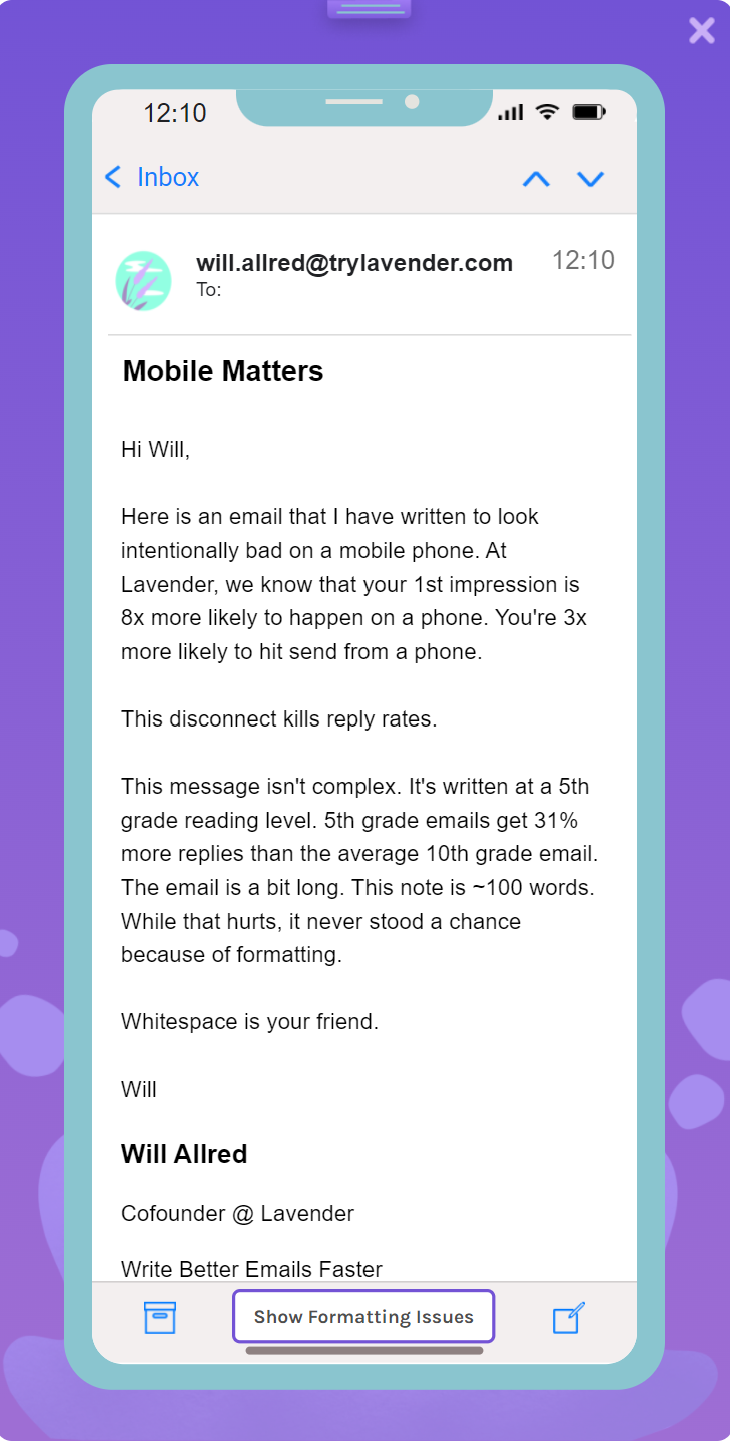
Those big paragraphs are a nightmare for your reader. It's not because they're hard to read. They're not. It's at a 5th-grade reading level.
It's because your reader's first impression is "Woah... that's a lot of work." Your reader doesn't want that.
If you're sending within a thread, this problem is even worse.

You'd never know there's an issue. This is exactly why mobile formatting is tied with not asking questions as the #1 reason that conversations die.
If you're in sales... you don't want that to happen.
Do yourself a favor. Make whitespace your friend (and use our product). No one is going to be upset you made your writing easier to read.


.png)

